Why Pie Charts Don’t Work – Improving Data Visualization
07/23/2014

There is quite the debate surrounding the effectiveness of pie charts. They are criticized by data visualization experts like Stephen Few and Edward Tufte for their lack of value and usefulness in monitoring and analyzing data. Despite this, pie charts remain one of the most common forms of visual display used to represent statistical data in the corporate world.
We are often left wondering: since pie charts are so pervasive in the business world, should we just continue using them? Research by data visualization experts says no. Just because something is common doesn’t mean it’s a good approach. So should we follow the advice and stop? If they are that bad, why do so many people still use them? Let’s take a look at some of the issues with pie charts and what can be used instead, so that you know when to skip the pie.
We’ll start off by looking at the ONE advantage that pie charts bring to data which is the reason why they are such a popular visual display media.
Pie charts can present data in a simple and easy to understand manner – if there are very few data points and you are comparing each to the total. The example below displays the top three most common injury types that have been reported in incidents for the past year.
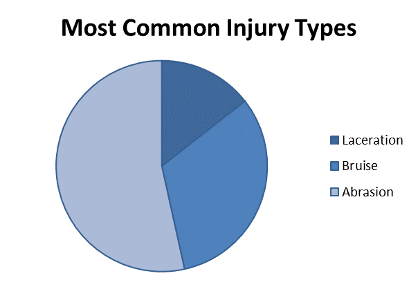
It’s easy to tell what the most common and least common injury type is between the injury types being represented. So far so good, but does this clarity work in all cases? Realistically, much of the data you are analyzing won’t be as clearly segmented, and there will often be more than three pieces of data to compare.
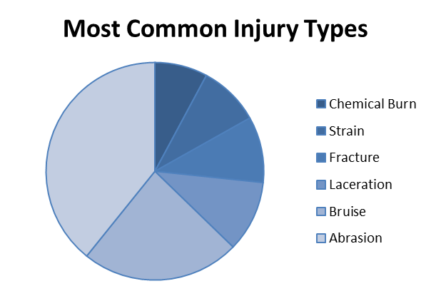
Now we’ve added more slices to the pie to compare the injury types that have been reported in incidents. It’s still clear that the more common injury types remain Abrasion and Bruise; however it’s harder to compare the difference between Laceration, Fracture, Strain and Chemical Burn as the pie slices look very similar.
Another issue with this pie chart is that the additional pie slices force me to remember the color association for each injury type. If more injury types were to be added to this chart, this task becomes increasingly difficult.
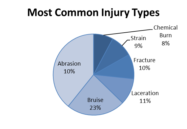
In order to get around these issues, we could add labels to the pie chart. By adding labels we’ll get rid of the issue of clarity between the different slices of the pie. We also eliminate the issue of having to memorize the color to injury type association.
This problem now, though, is that we still need to remember each value, and compare them in our head. We do not have the ability to perform a comparison visually.
Problem 3: Too Many Ingredients – A Recipe For Clutter
As the pie grows we can add labels to know exactly what each piece of the pie represents and can compare each slice individually. But this doesn’t seem right - the advantage of using a pie chart is supposed to be its simplicity and clear visual representation! All of a sudden we have cluttered our pie chart with too many labels just to contain the context needed in order for this pie chart to be truly useful.
While pie charts have one advantage for small data sets, they have several disadvantages. It really comes down to this – what is it that you are trying to get out of your data? With a clear answer to this question, you can better determine the most appropriate form of display. Here are a few alternative display methods which may be more suitable to represent your data.
Pie Chart Alternatives
Solution 1: Big Numbers
If you are interested in finding out the top three injury types that were reported in incidents, the pie chart from our first example may still be appropriate. However, if the numbers are close, it may be difficult to make an accurate comparison between the three values. Instead you could consider a different means of displaying that information; such as “big numbers”. Using a big number eliminates the need of having memorized color codes for each injury type while doing your analysis and you also do not run the risk of not being able to compare your values since they will be immediately available to you.

Big numbers worked well in the above example for a quick comparison but wouldn’t be practical for displaying any more than three categories of data, as you still need to keep the data in your head – there is no visual comparison.
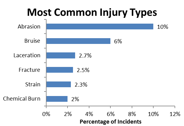
Solution 2: Bar Charts
Next we’ll try a horizontal bar chart which will easily allow us to compare the information needed at a glance. Again we are not being troubled to memorize color codes to match what each bar represents. We can also add labels at the end of the bars to represent what the value of the bars are if we are interested in exact values. This does not cause clutter and we are not overlapping labels within our graph, unlike in the pie chart example.
In the scenarios described above, the alternative display media work better at meeting our data objectives then a pie chart. It is important to keep in mind that the display media you choose is dependent on what you are trying to get out of your data.
Conclusion
You now have a better understanding of the VelocityEHS approach to data visualization and insight into the way our software is designed. Our goal is to provide intuitive and simple software that helps improve organizational performance. When your company has a complex global structure, it is important to be able to easily summarize large amounts of data in a way that can help you improve overall EHS performance.